Cascading Style Sheets (CSS) the size of an element is expressed by length units consisting of small letter/symbols that follow a value. For example, 10px, 2em, 100%, etc.)
Here is a quick guide to understanding the following elements that use a length value:
Absolute Length Values
These values are absolute because they are not relative to any other element. They will not scale to the users browser size and will always remain the same size. They include
- pt (points)
- px (pixels)
- in (inches)
- cm (centimeters)
- mm (millimeters)
- pc (picas)
The only one we need to worry about for digital media, is pixels. The rest of them are examples used in print. Each pixel represents one “dot” of your device display. So use pixels when you don’t necessarily need to scale with the viewers browser size.
Relative Length Units
Relative length units are relative because they can change/scale depending on the length of other elements in your website. A very common one is percentage, which is a dependent on the length of the parent element.
- em (relative to the element’s font-size)
- rem (relative to the root element’s font-size)
- vw (relative to 1% of your browser’s viewport width)
- vh (relative to 1% of your browser’s viewport height)
- vmin (relative to 1% of the smaller of the two browser viewport dimensions (height or width).)
- vmax (relative to 1% of the larger of the two browser viewport dimensions (height or width).)
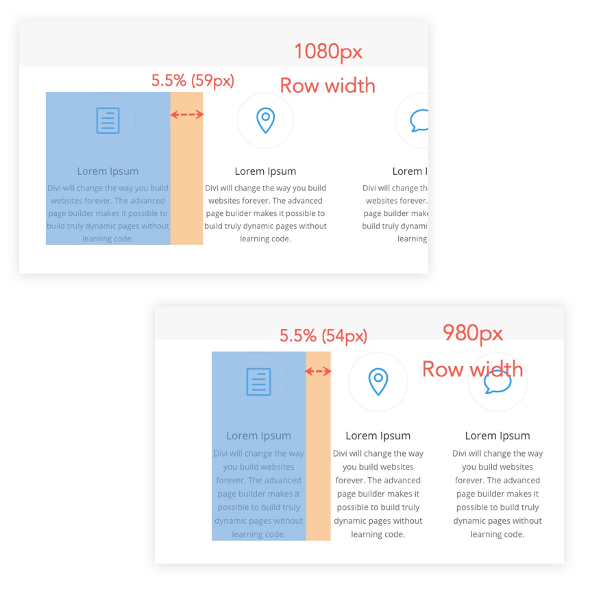
- % (relative to 1/100 of the parent element’s width.)
Suggested length units for WIDTH
Common Length Units: %, vw and px

Suggested length units for MARGIN
Common Length Units: %, vw and px
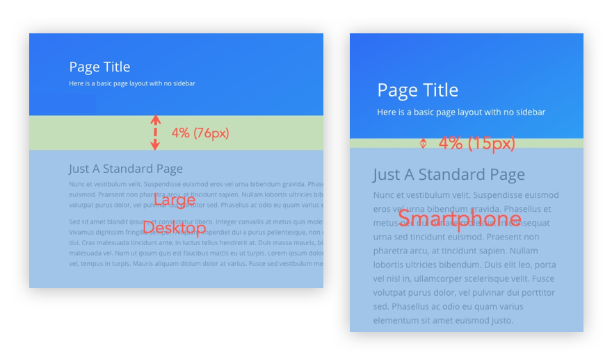
The margin property uses length units to add spacing outside the element. Here is an example based on the device screen size and using % unit of measurement.
Suggested length units for PADDING
Common Length Units: %, vw, vh, em and px
Before the need of fluid or responsive design, I often used pixels for padding for everything. Padding should scale to the size of the browser, so using a fixed pixel amount is not going to work out very well. Here is an example of how percentage can work great between desktop and mobile devices.
Suggested length units for BORDERS
Common Length Units: px, em and vw
The most common unit is pixels because it is fixed, rather then having the border scale based on browser window. I also think that most graphic designers who deal with print are going to be more comfortable with a fixed amount. Border do not support the % unit.
Suggested length units for TEXT
Common Length Units: px, em and maybe vw
This applies to line-height and letter-spacing.
Using vw for headlines can be a great tool.